designer- maker - visualizer
UX designer enthusiastic about simplifying complex problems to create intuitive interactions that shaped user experiences with great value.
Currently working for Expeditors International in Seattle, where I collaborate with a great team of people tasked to solve complex problems creating Expeditors next generation enterprise applications.
Challenges motivate me to learn new things, expand my creativity and continuously increase my critical thinking skills. For the past year I have been learning more about CSS preprocessors and front-end development workflows.
On my free time, I enjoy hanging out with friends, biking, hiking, snowboarding, reading, and learning new technologies.
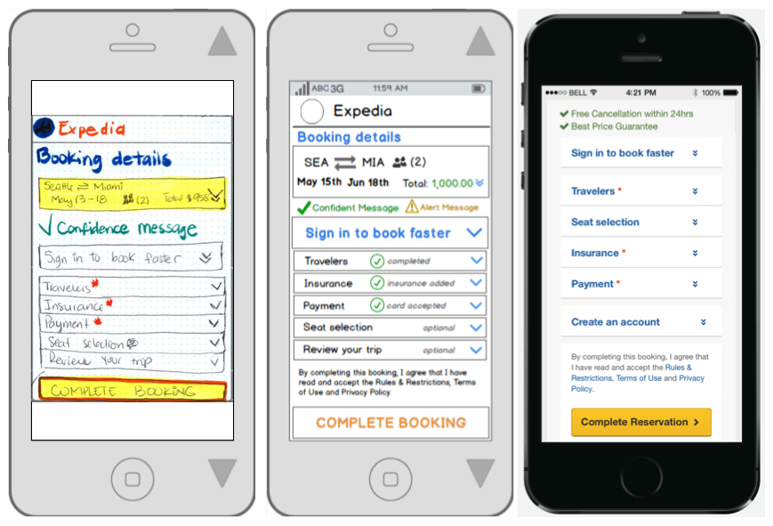
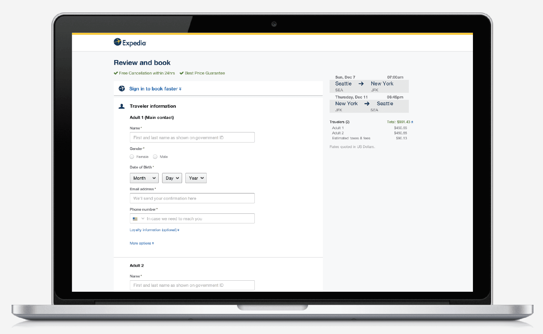
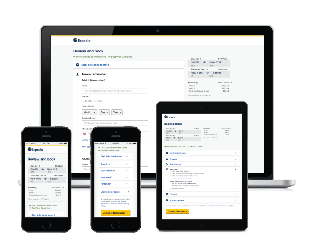
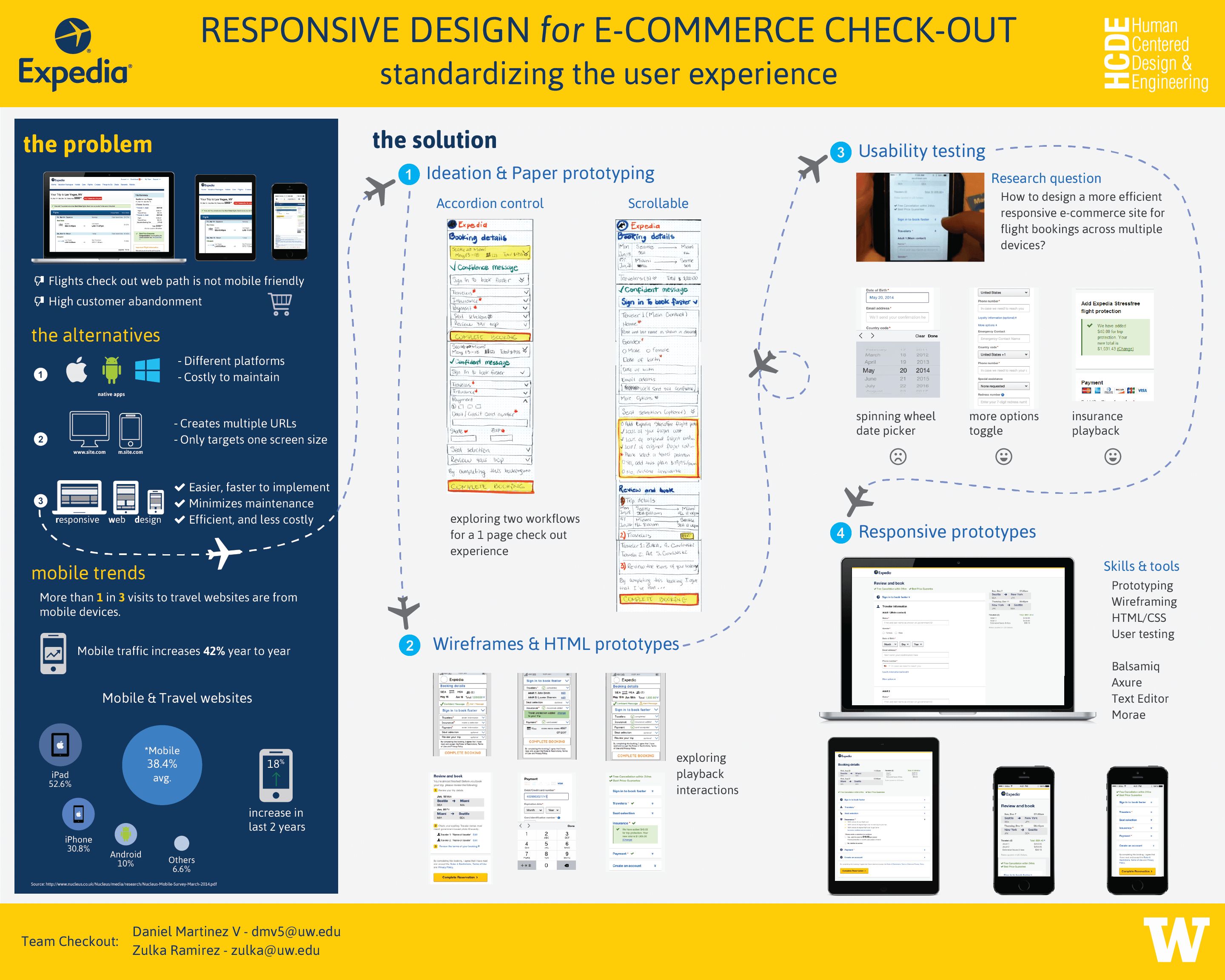
With the current state of the web and its growing mobile users base, we worked closely with Expedia.com to redesign and create a better and standardized user experience for the flight check out webpages. With Responsive Web Design, Expedia can provide a much more streamlined experience to its users no matter what device they try to book a flight from. At the end of a three month project, we produced two different responsive prototypes. We initiated by creating paper prototypes and understanding how complex a one-page check out website will look like on a mobile device. After multiple iterations, we transitioned to creating html/css prototypes and at the same time using jquery to create subtle interactions. We focused on creating a very efficient user experience while booking a non-stop roundtrip flight for a couple within the U.S.
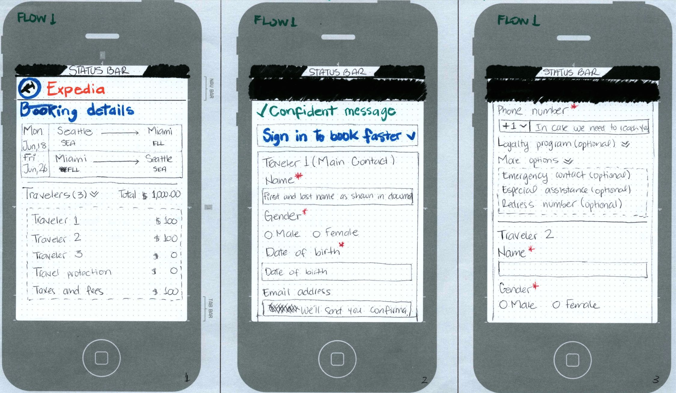
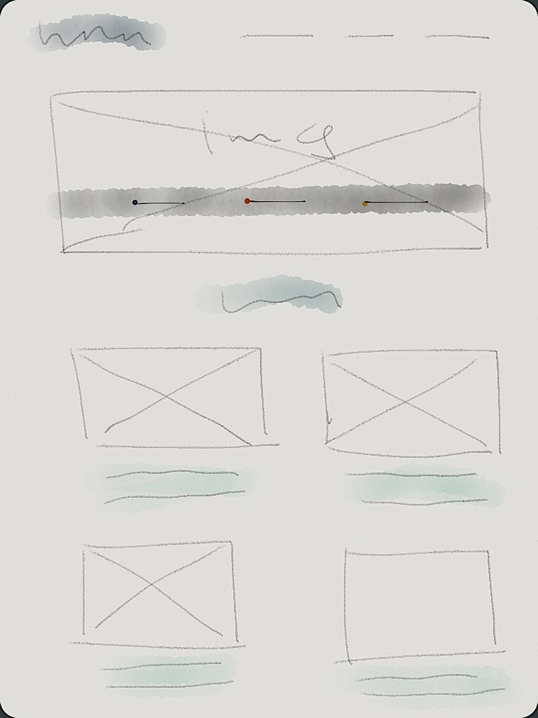
At the beginning of this project each team-member went on its own to brainstorm and sketch the best possible solutions for a single page check out experience. At the time, expedia.com flight checkout page consisted of 2 different pages. The first page is about passenger information and the second one is about insurance and payment information. During these three weeks we presented the sketches to the flights team to get feedback and improve what was needed according to the requirements. Below there is an example for one of our final sketches.
Scrollable experience
Right as we began working on this project we created a process blog documenting our weekly progress, obstacles and design decisions. You can visit it to learn more about our design process.
During our ideation and sketching phase we came out with two different workflows for the single page check out experience. The first user flow was a scrollable experience, where all the page modules were expanded, and input fields exposed for users to fill out as they scroll down. The second user flow consisted of an accordion control experience, as opposed to the first workflow, the accordion workflow guided users through the steps required to complete the flight check out and also helped users get a better sense of the overall experience. We used red asterisks to denote the required steps.
Once we finalized both user flows, we transitioned to write our hypotheses and tasks to test both flows with 10 participants. We also created a debrief questionnaire to measure participants satisfaction with each flow.
For two days we had ten particpants coming in to the usability lab and go entirely through each user flow. Each participant was tasked to go to expedia.com find a non-stop roundtrip flight from Seattle to New York or Miami. We first begin running our test using an iPad Mini, but after the third participant we realized that the device screen was very forgiving and they were not realizing that each flow was different. After that, we continued testing on an iPhone device.
After gathering all the data from ten participants, these were our findings:
We concluded that the scrollable experience was more successful than the accordion experience
Check out our poster to find out more about our process and usability results
Within this project I was highly involved in all its phases. Both team-members also worked closely with the flights check out team at Expedia to better understand the existing needs to make the checkout page as efficient as possible. Some of the tasks I contributed to were:
During this class I learned that delightful and engaging visual media relies on the right combination of color, layout, typography, photography, and iconography, among other materials, to communicate concepts or attract attention. With relevant and meaningful visual elements, aesthetic interfaces can be created to stimulate emotions or simply a good experience. During the time in class, we explored topics such as typography, hierarchy, layout, color, web design, and print media.
My main goal during this class was to create a hi-fidelity mockup for my new portfolio. As any user experience designer, I began doing some sketches of how I was envisioning my website. After couple sketches, it was clear for me that I wanted something simple, straightforward, and easy to maintain. So my first decision for the design was to have the front content in one page, the second decision was to make use of a modal to display information about my projects.
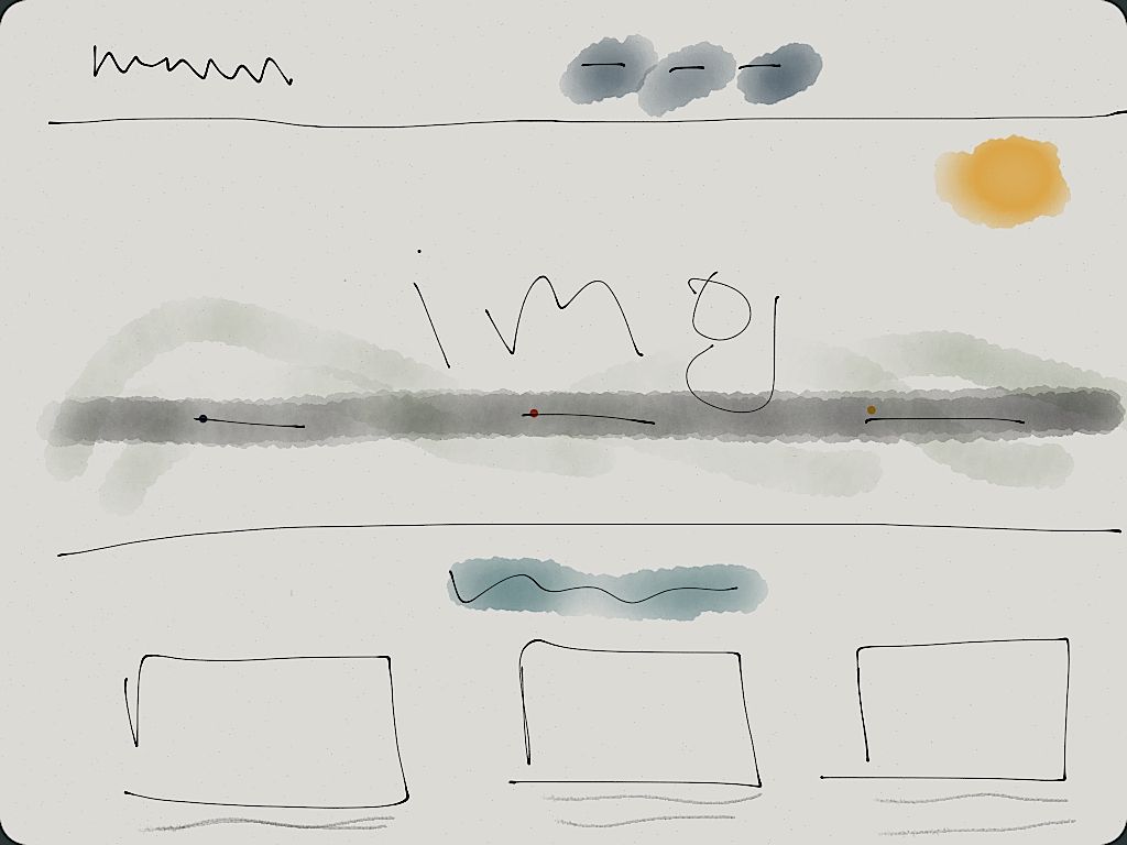
Below are some examples of my sketches, using the paper app:
Mobile
Tablet
Desktop
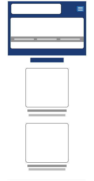
I used omnigraffle to craft my wireframes, I wanted to really understand how I should display project thumbnails for each viewport size (mobile, tablet, & desktop. I also wanted to make sure my navbar was still usable in tablet and mobile screens. Since my website was going to be accessed from a mobile or tablet device, I decided that on those screens it was necessary to have a fixed collapsed navbar. Another design decision I made after I created my wireframes was to make sure any project information modal was going to cover the entire device screen.
These are the three main wireframes for each screen size I was targeting:
Mobile
Tablet
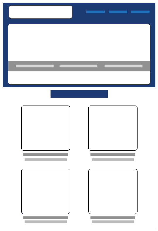
Desktop
Using illustrator and photoshop, I was able to create a very realistic mockup for the new design of my portfolio. I was also very particular about picking a good combination of warm and cool colors to provide a soothing yet vivid user experience for anyone that sees my portfolio. During this mockup design, I also used the 12 column grid system to guide my design and also to use it as a reference point when I was coding it using the bootstrap framework
Mobile
Tablet
Desktop
If you are interested to see more graphical elements I created during this class check out the final presentation
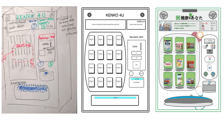
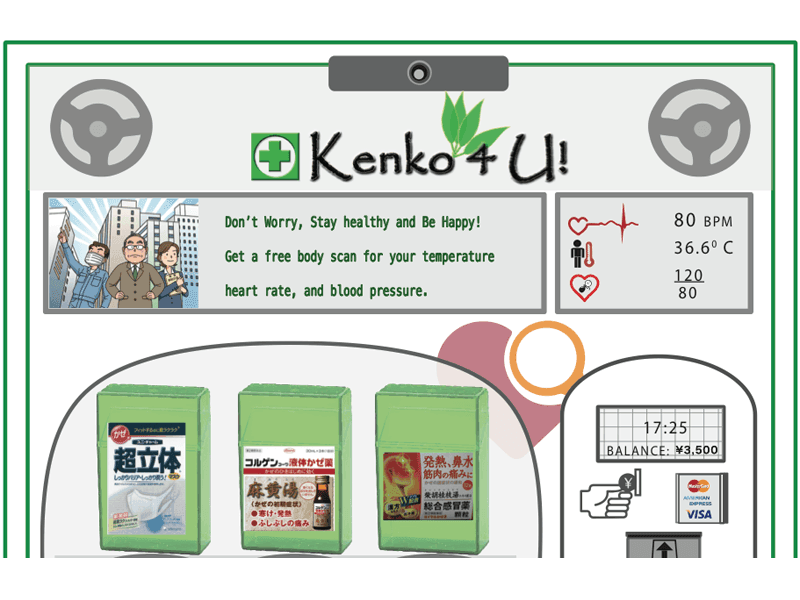
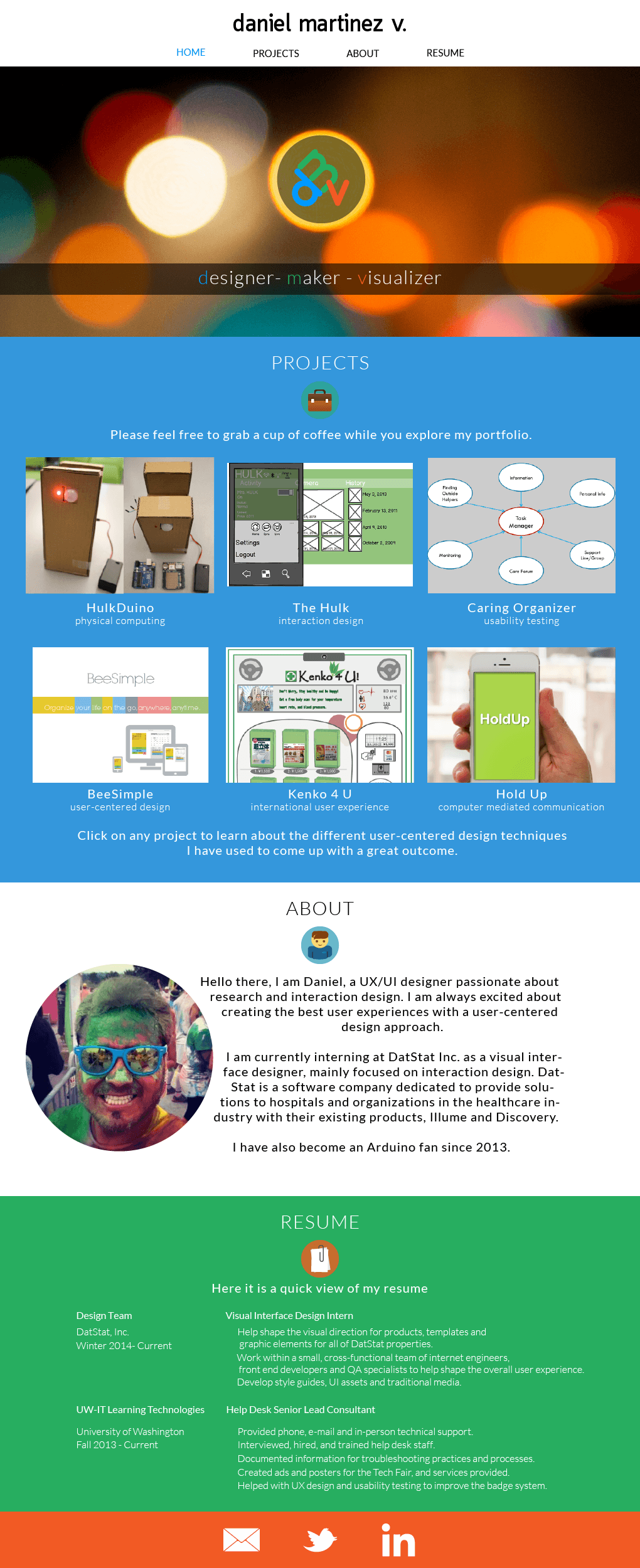
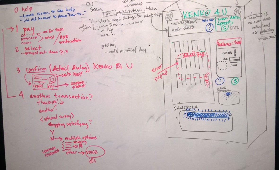
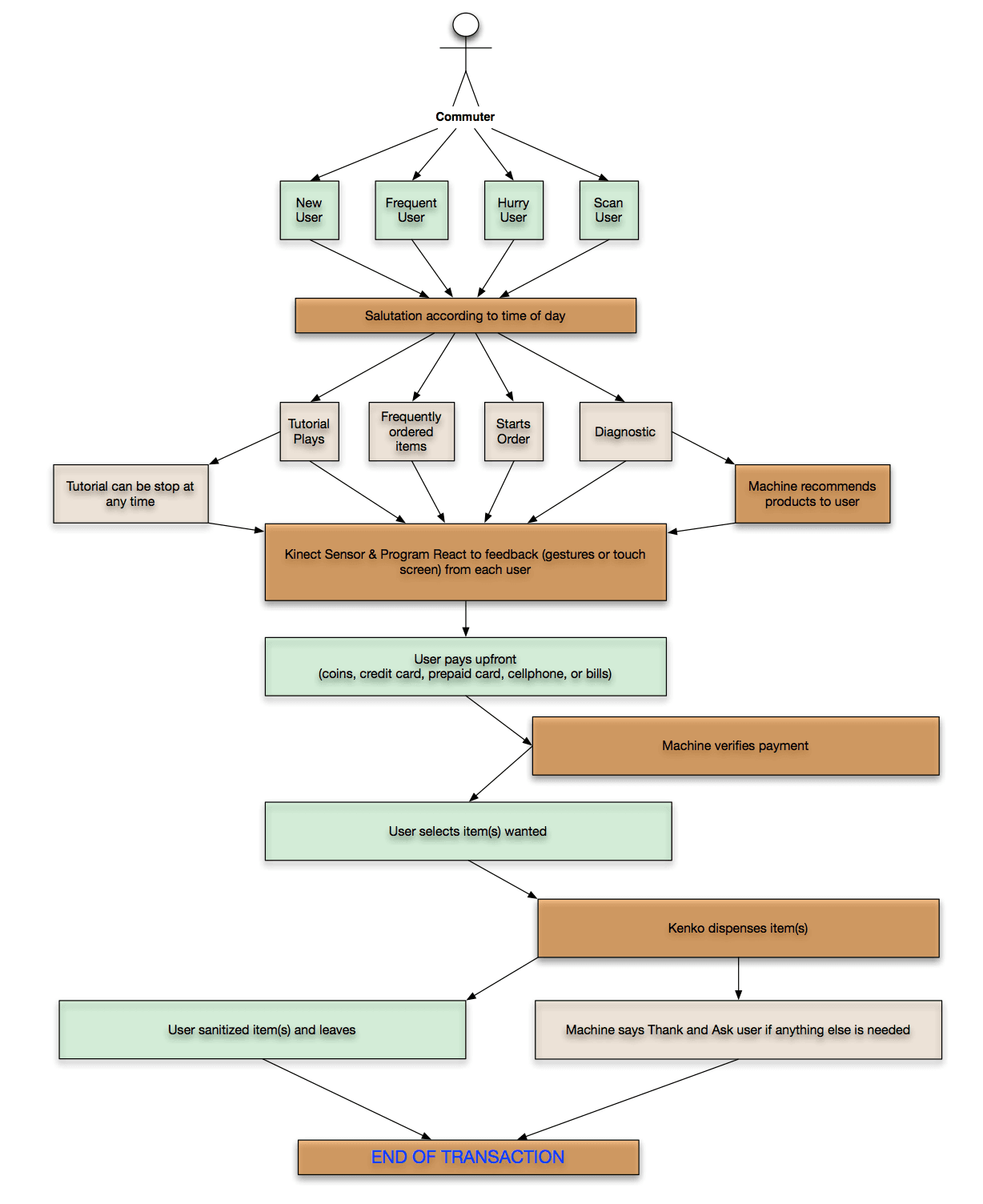
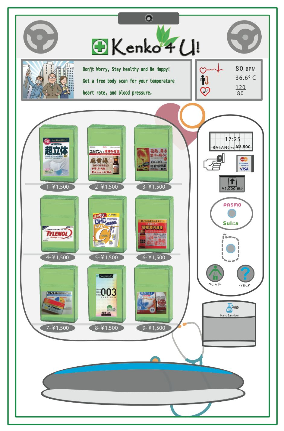
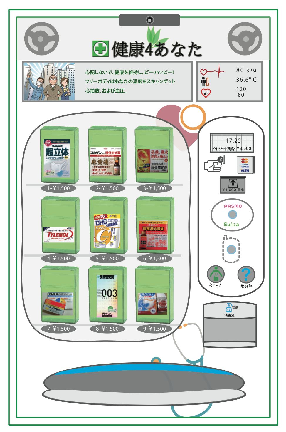
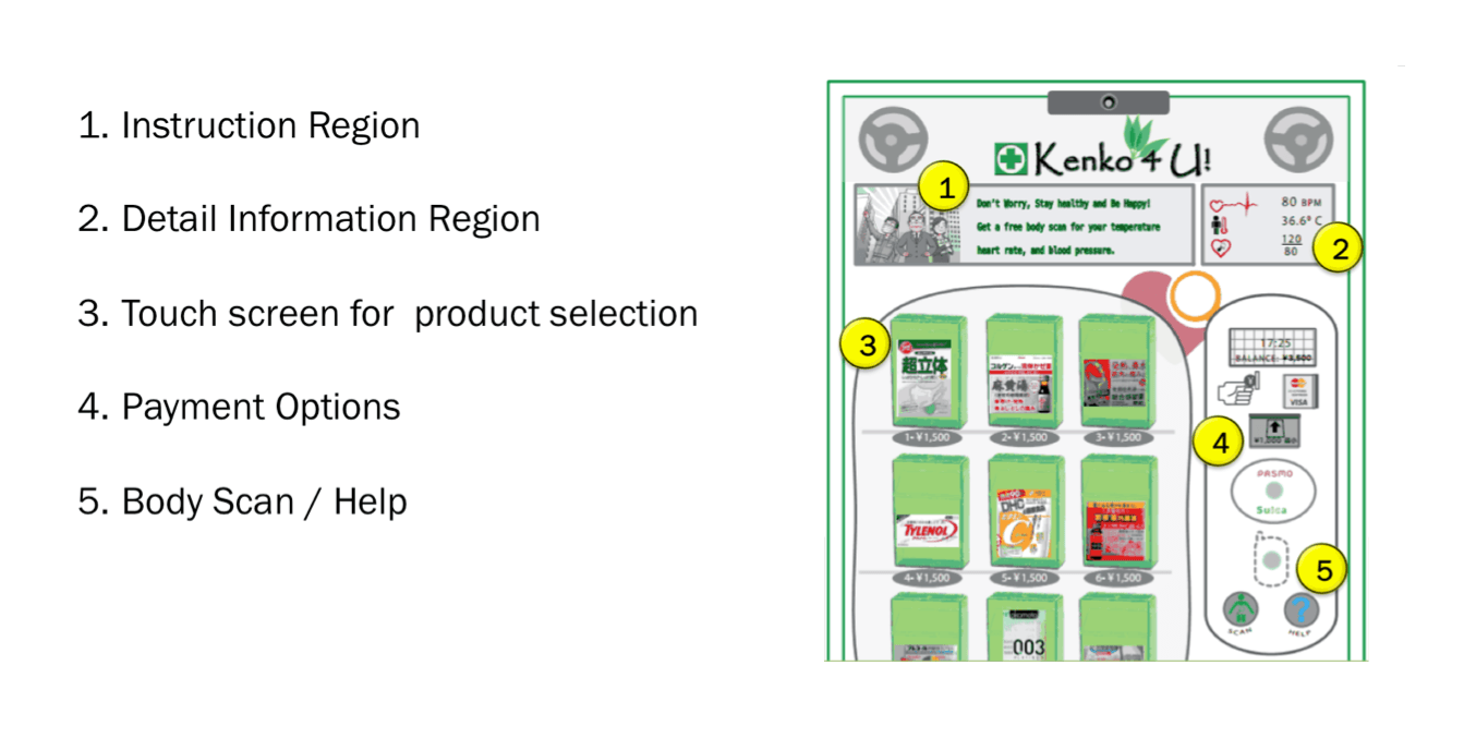
During my international user experience class, our team was tasked to repurpose a cigarette vending machine in a country of our choosing. Our team decided to design for the Japanese culture. We started out by looking at Japan's Hofstede cultural profile to better understand its dimensions and values in order to inform our design decisions and interactions. The new purpose of our vending machine was to dispense over the counter health related products such as band-aids, cough medicine, face masks, condoms, and many others. We developed a clickable prototype using balsamiq to demonstrate what the interactions were like. We also dedicated time to create the graphical design and visual appearance of the interface.
The concept for our final design was based out of a simple cigarette vending machine similar to the shown in the photo below. Our main focus with this project was clearly understand the cultural implications of our design. We were envisioning a smart vending machine that will dispense health related products. We decided to make use of the Kinect sensor to detect a user approaching the vending machine, which will display a custom message based on the time of day and prompt them to pick a product or take the health check service such as blood pressure, and temperature.
Sketch
User flow
For this stage in our process we reviewed existing literature about cultural values and dimensions for the Japanese culture. We also knew that vending machines are very popular in Japan, specially at transportation hubs such as airports and train stations.
Here is a quick summary of the literature we reviewed:
Besides reviewing some literature we also designed and conducted a survey to validate some of our design decisions and to find out how viable was the idea of selling health related products. We distributed the survey in multiple Japanese online communities in order to have a more reliability in our data.
For the final design, we used all the information collected from our survey as well as literature review. We used illustrator to mockup the user interface of the frontal side of our vending machine.
English
Japanese
Feel free to interact with our clickable prototype
During this project I was very interested to learn how to design a very robust survey in order to gather relevant data for the design, so I spend time creating specific questions for the type data we wanted to capture. I also design the the user interface using that data and feedback from my classmmates
Other tasks that I performed were:
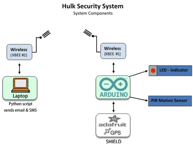
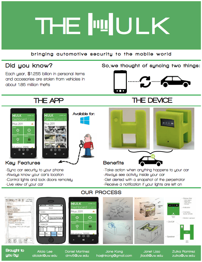
The idea of the HULK is that whoever has it in a car, this is protected if someone breaks in, the HULK (Arduino micro-controller) will send an alert to the car owner notifying that something is going on inside the car. When a user receives the notification, the HULK would have sent the GPS coordinates obtained from the GPS shield.The main idea is that with the current existing technology loud noisy car alarms go off and yet a car owner is not notified that there is a threat. The Hulk prototype allows car owners to be in-synced with their cars. Solving a latent need for car owners. With the current timeframe in this project, what I have accomplished is creating a prototype that has a motion sensor that once it is triggered, the Arduino will send a text message and/or e-mail to a car owner, also it will send the most recent GPS location of the device.
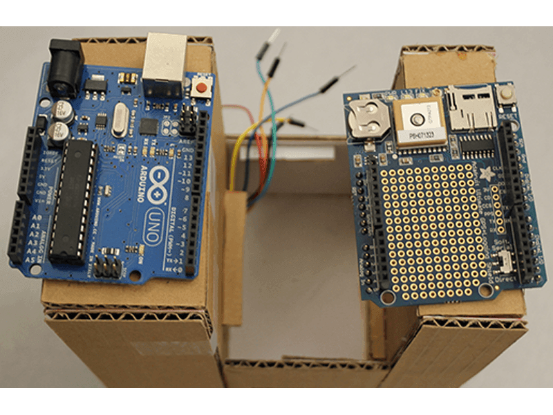
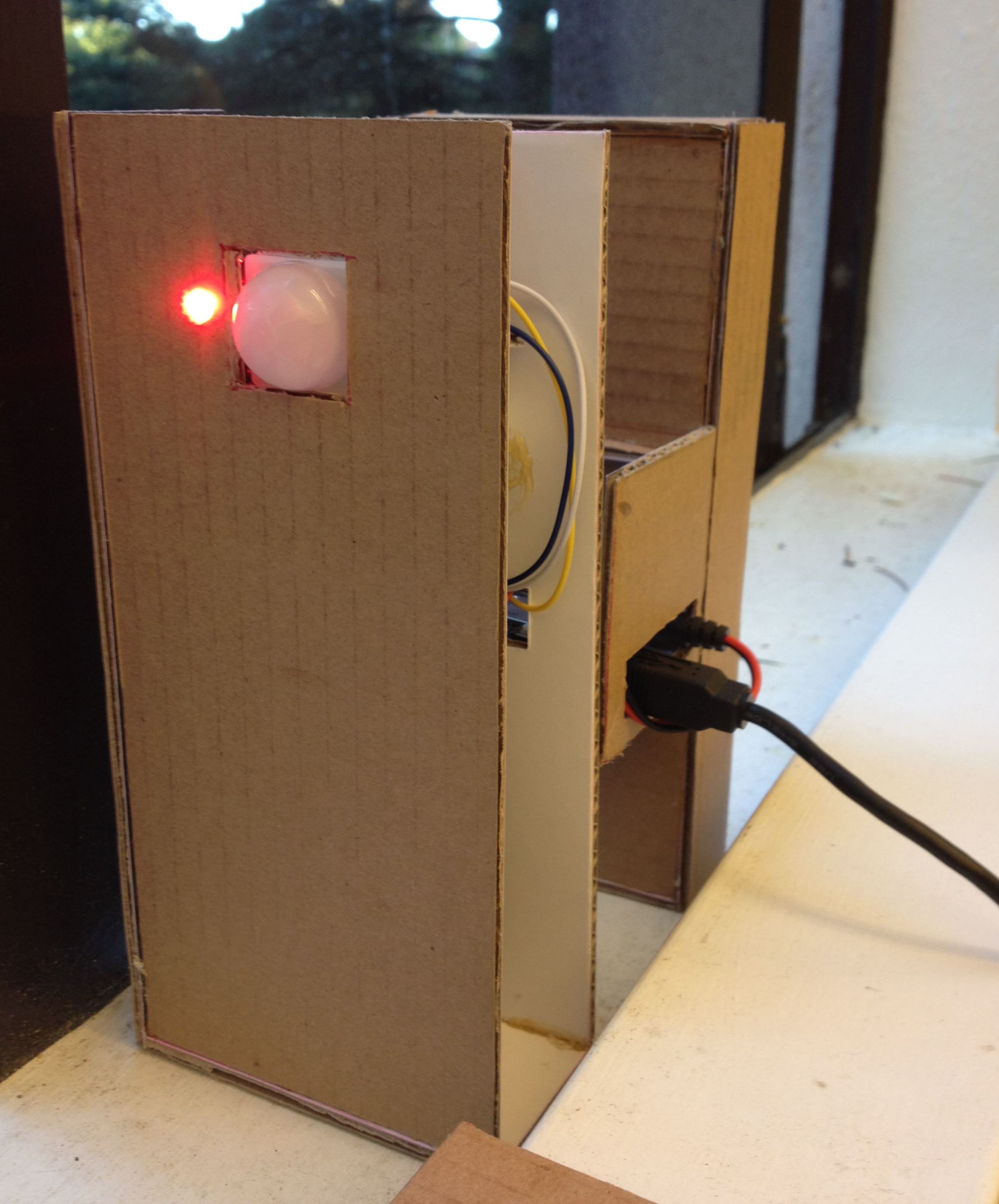
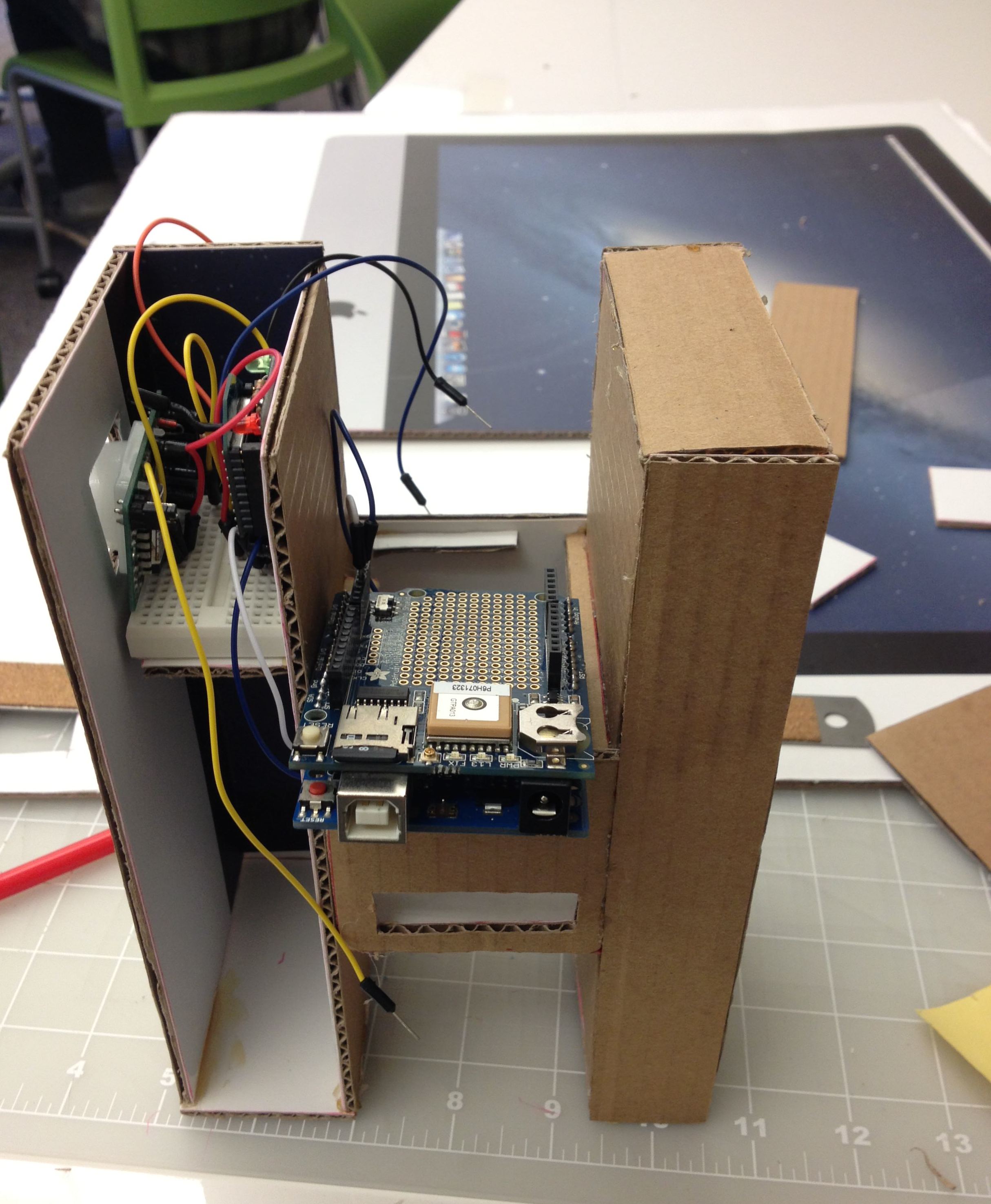
The idea of the hulk security system came from a previous project I worked on during my interaction design class. For this project I mostly focused on creating a proof of concept using the Arduino technology. Using a PIR motion sensor, an Arduino UNO board, a GPS shield, XBees, and some LEDs; I was able to prototype a functional Hulk Security system. The images below show the final prototype made out of cardboard and the components inside.
Final Prototype
The Hulk device system had a XBee radio module, which is the component that simulate the wireless functionality, there was another XBee connected to a computer, waiting to execute a python script when the Hulk device detected motion. This is how it sends an email and a text message.
Notification System
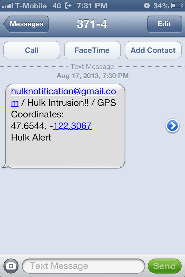
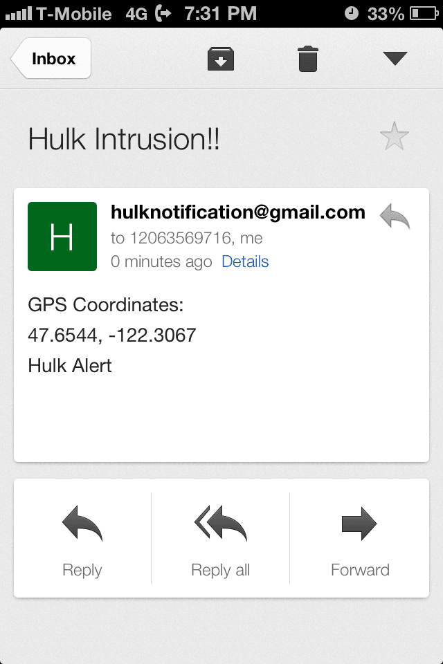
This notification system solve the issue of being too far away from your car and not notice that someone had broken into it until you went back. The secend version of this prototype will have a simcard from any phone company provider to text or email you when something happens to your car. It will also support multi text messages because it will be using the Twilio API.
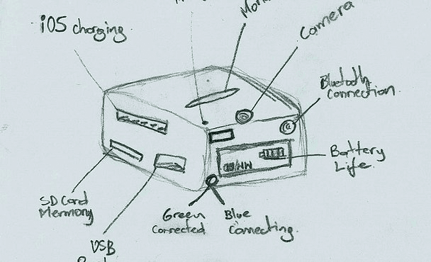
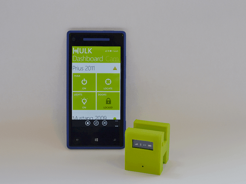
The idea of the Hulk app and device came from realizing how cars and their owners are so desynchronized in this mobile era. As a team, we deciced that the Hulk will allow cars to communicate directly with their owners if something out of the ordinary was going on. The synced device to the owner's Windows Phone would send notifications if someone will break in the car; it will also allow the owner to turn off/on car lights, lock/unlock car doors, and get a GPS location of the car. After multiple iterations on both the app and the device, we created a very realistic product.
After developing different scenarios, each team member sketched how a user would look like interacting with the app and the device. After that round, we decided what we needed to prioritize in each system. Each team member prototype the Hulk app with the defined set of requirements.
You can also check out our wireframes here
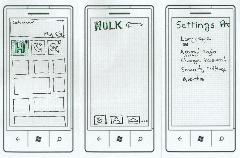
Each team member focused on a specific user-flow from the app. I decided to work on "Settings". We wanted to make sure users were able to customize some features of the app. First, we did user-flows with paper prototypes and then brought it up to a higher fidelity using Balsamiq. With this we were able to refine how the app would look like. You can see our user flows here.
Finally, after testing our first Hi-Fi prototype created with Axure, we once more iterated using feedback from users. The team collected feedback for both the hulk app and device. With our design we made sure it was intuitive, user-friendly and gave customization power to the users. You can see the final presentation and a short clip of our mobile app prototype.
the hulk at a glance
After developing different scenarios, each team member sketched how users will interact with the app and the device. After that round, we decided what we needed to prioritize in each system. Each team member prototype the Hulk app with the defined set of requirements. I was highly involved with the design for the hulk devices and the settings UI for the Windows phone app.
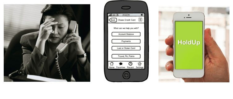
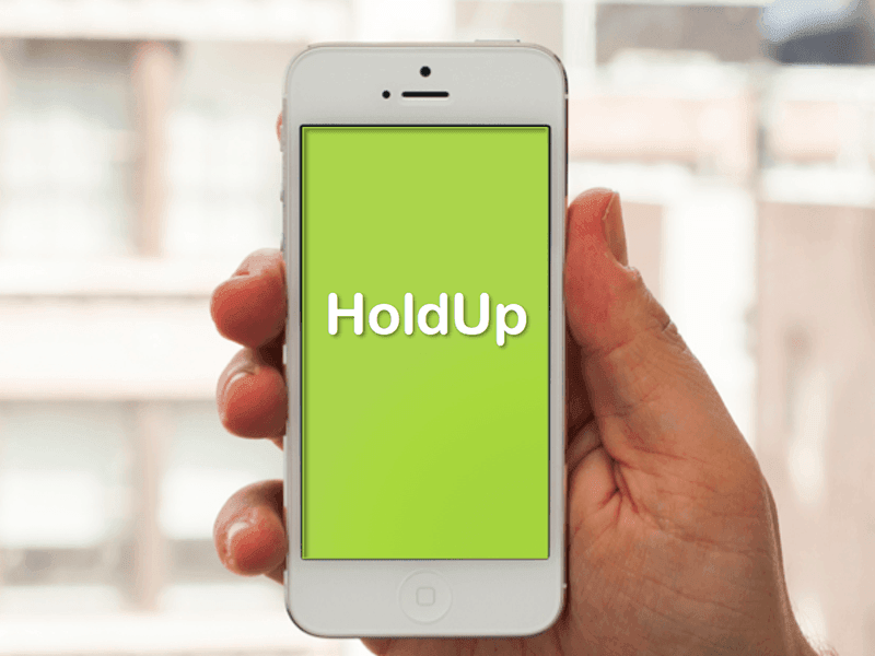
From theory to practice, we were able to discover a bottleneck and solve a painful user-experience with existing Interactive Voice Response (IVR) systems. The automated voice menus that people hear when calling banks, cable providers, airlines, and other businesses. Using theory and research, we redesigned IVR systems for 21st century mobile phones. The product was an exact visual menu map of the Chase IVR map structures.
To learn more about our project, you can read our paper or simply go through our slide deck to explore our motivations to solve this problem, essential features, and a prototype walkthrough.
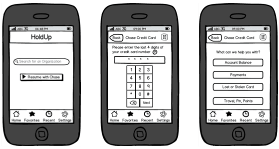
HoldUp Wireframes
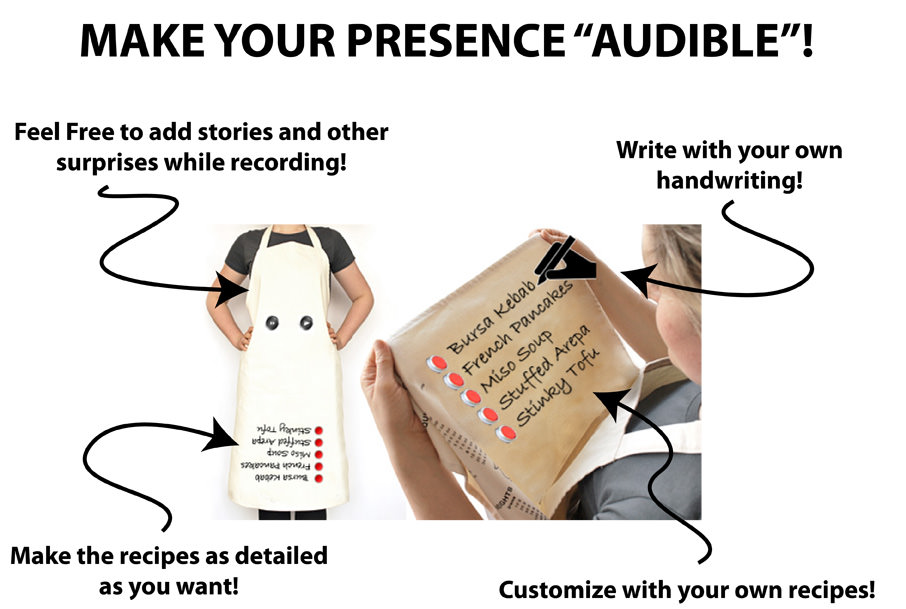
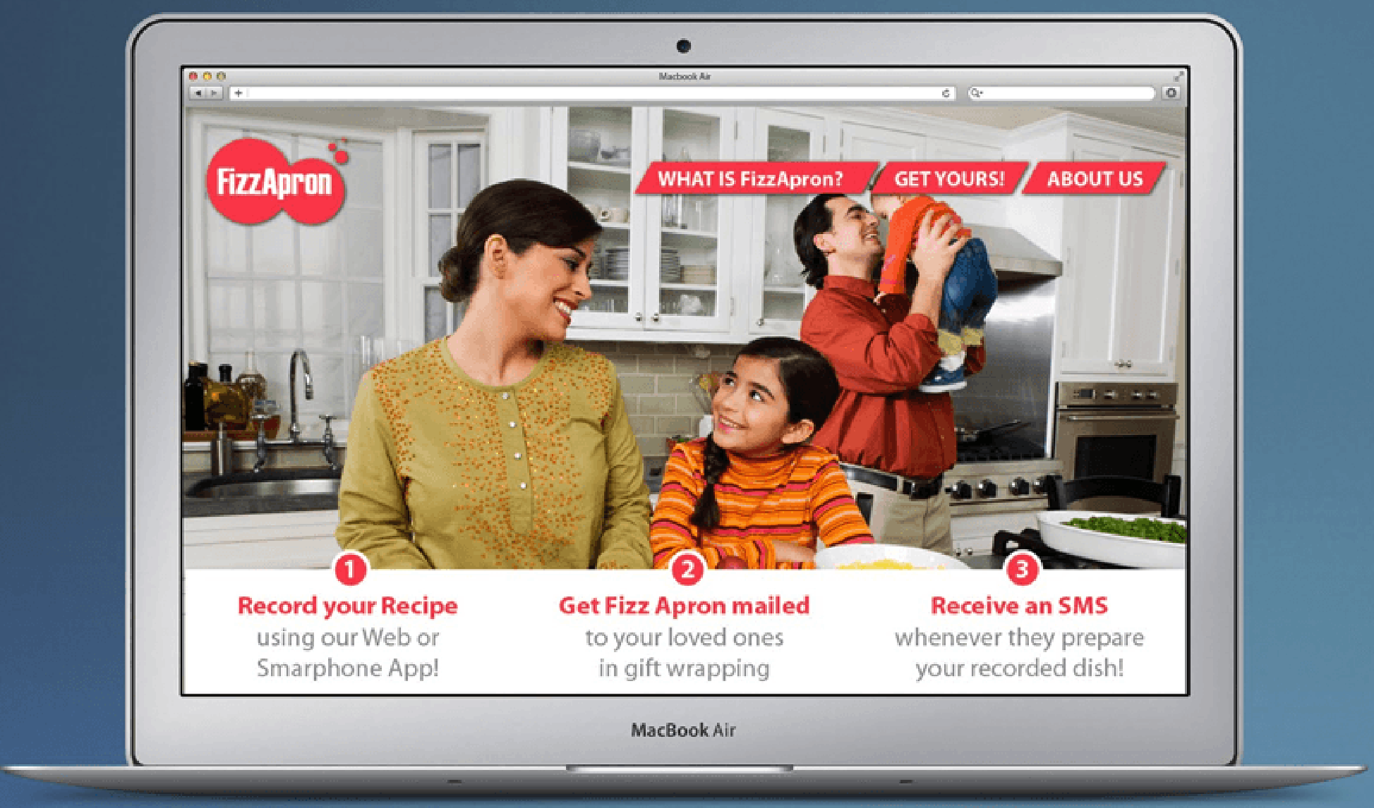
Fizz apron is a smart apron, allowing you to share your valuable recipes with your loved ones as if you are right next to them. They will listen to the recipes from your own voice and you will receive and SMS/e-mail when they cook one of your recordings.
Getting your FizzApron is simple: First, record your cooking process through our website or smartphone app. Then, we will embed it to your FizzApron and ship it to the person you would like to share your recipes with. With FizzApron, you don’t gift them your recipes — you gift them the experience of preparing meals in your presence!
The idea for this apron came from brainstorming ideas based on communicating “practice over time.” Consider this at three possible scales: intimate (personal), familial (group), civic (society). With this in mind, the team decided to focused on communicating practice within the familial scale.
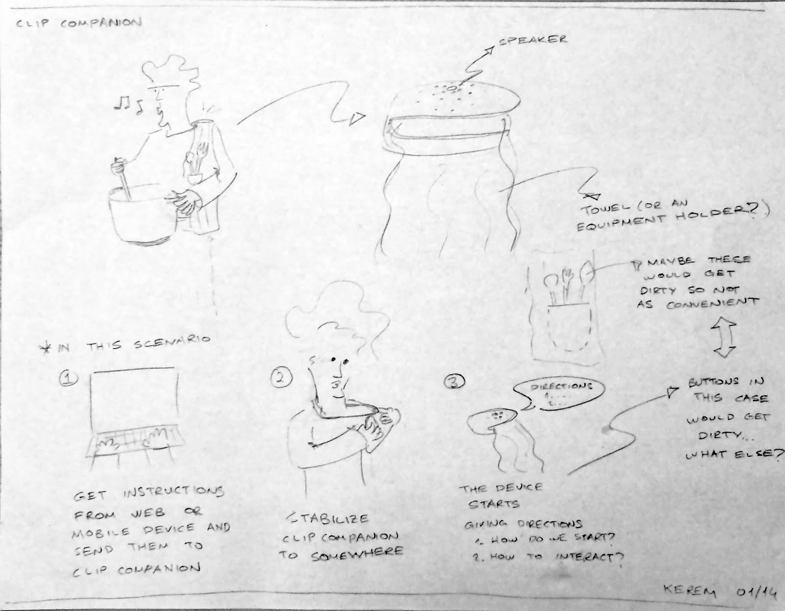
With this scope, we began brainstorming multiple scenarios, each team member sketched out what the concept would be like. We first had the idea of a "clip companion". It was a novel idea but it had not much inclusive value. We then thought of an apron and how we could use technology to connect families by transferring cooking traditions and knowledge. We made a video demonstrating that our first prototype worked.
During the first quarter the team focused on doing basic user research for recording recipes while cooking and capturing the needed interactions while someone was preparing a special dish. We had two users recording themselves while cooking to observe what needed to improve, how we had to break down the preparation steps, and finally understanding needed priorities for our first prototype. To document our process we also created a process blog. This guided us to what needed to be accomplished for the first prototype and also kept us inform of the design decisions we were making along the first iteration.
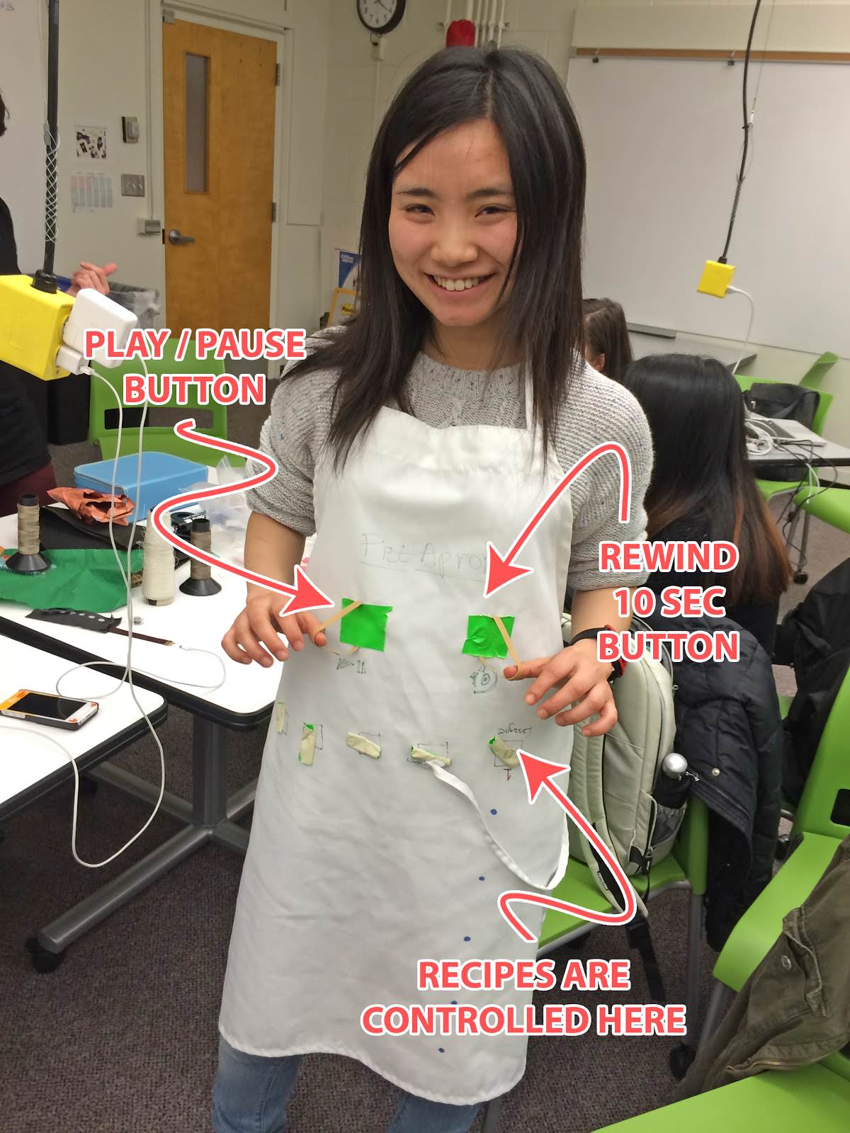
At the end of the first three months, we had a functional prototype using an Arduino Uno board, XBees for wireless communication, and elastic conductive fabric. We also create high fidelity mockups for the FizzApron website and iPhone App prototype. This first iteration was mostly a proof of concept to really distilled the main interactions for the higher fidelity prototype.
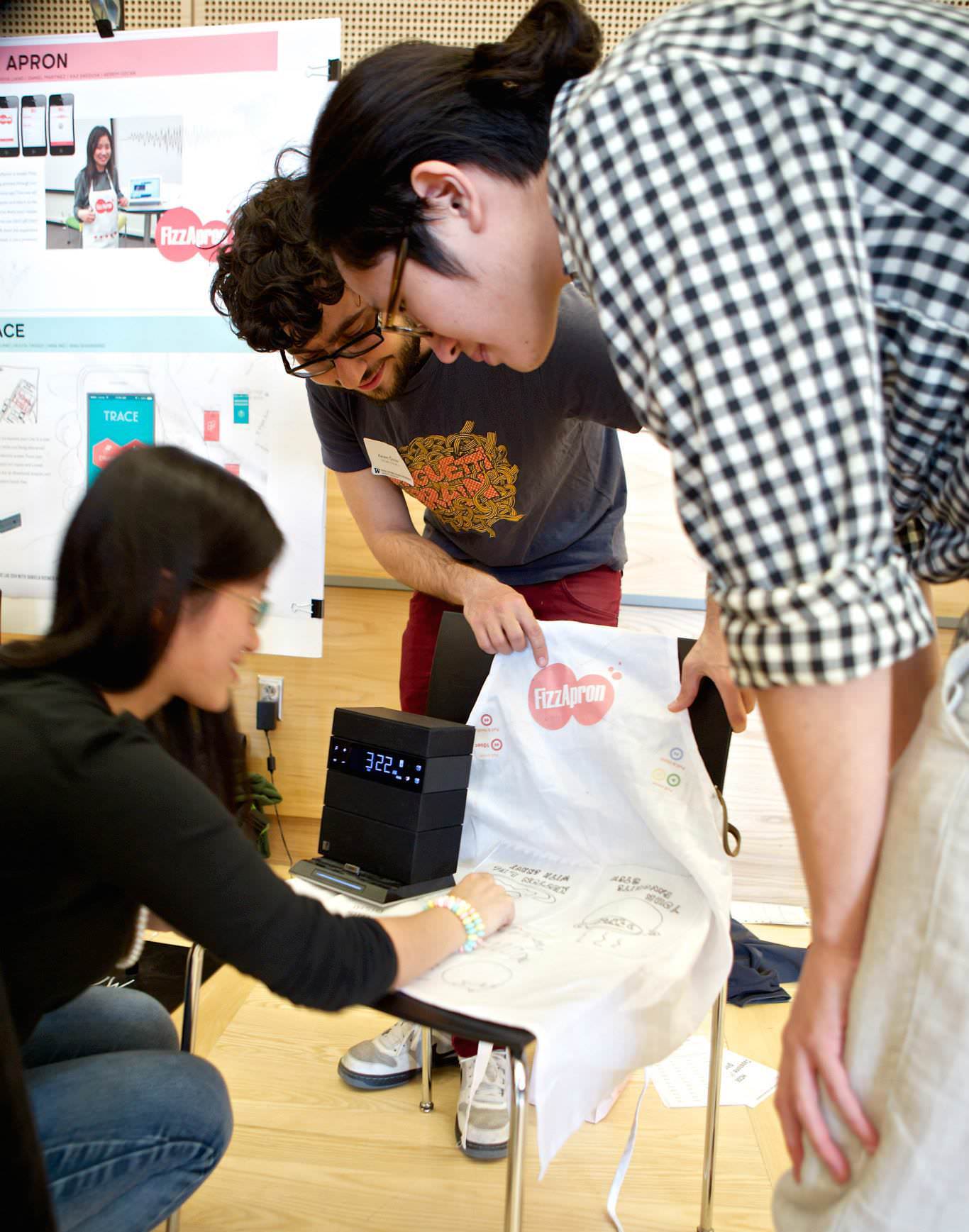
Due to the arduino platform limitations, the recording functionality was going to be handled by the website or the iPhone app. At the end of our second prototype, which we also created a second process blog, we really focused on successfully sewing the circuits with conductive thread and merging all the code.
Within this team, I decided to work as the project manager. Each of us took on different roles to make each quarter as productive as possible. It was also a highly collaborative group. We met twice a week to meet our weekly goals. During the six months we worked on this project I helped with the following:
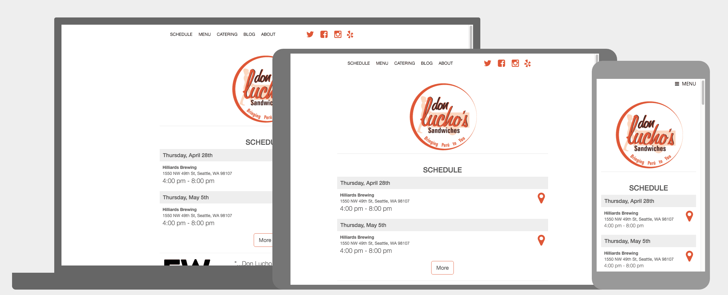
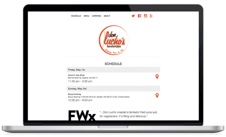
Don Luchos food cart is owned by Carlo Chalisea, I have known him for a few years and knew about his Food Cart idea. I talked to him about helping with his business website. I thought it would be a cool challenge to put my skills to work. I also approached Isaac asking if he wanted to collaborate and work creating a website for Carlo's artisan Peruvian sandwiches food cart. Carlo wanted a website that was an extension of his business, so that his customers knew when and where he was going to be next around the Seattle area.
Isaac and I partnered and decided it was a new and exciting challenge to design and develop Carlo’s website, and work with him closely as our first client. During the initial stage of the project I meet constantly with Carlo to come up with the main user stories that his website had to support.
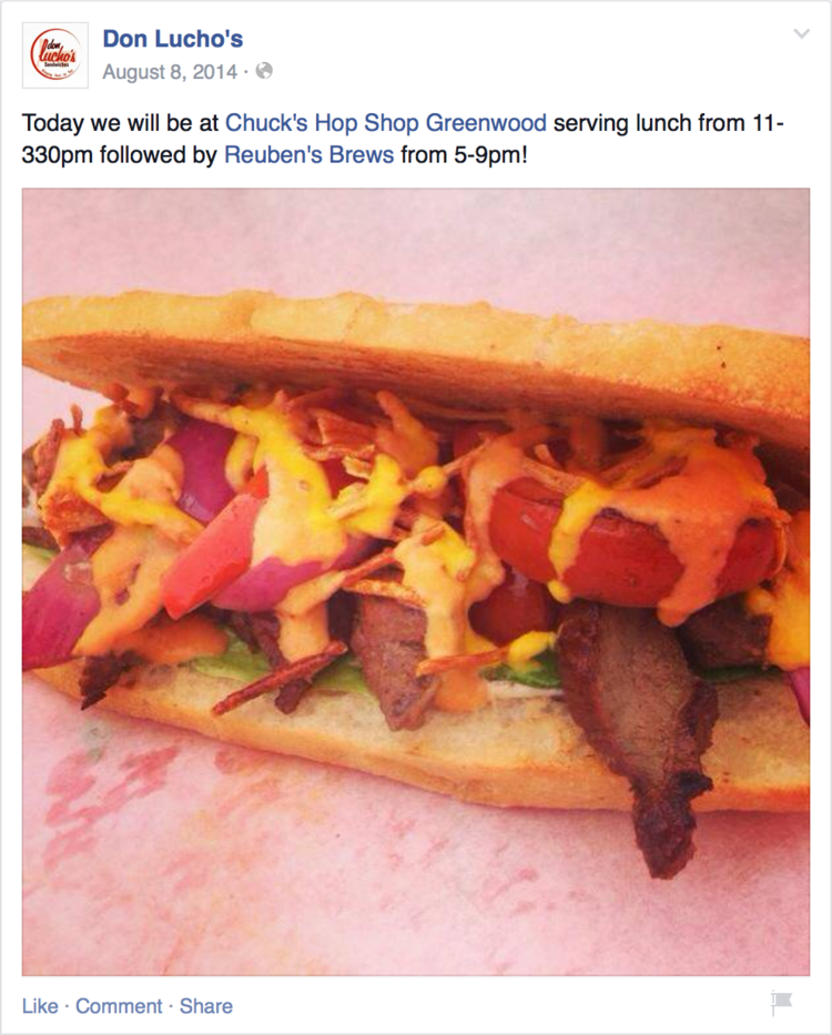
Many food carts visit different breweries each week at different times of the day, Carlo’s food cart was no different, his schedule constantly rotates or new locations were booked. At the beginning he was using Facebook, Instagram and other social media avenues to tell his customers about upcoming locations and hours and to show his menu.
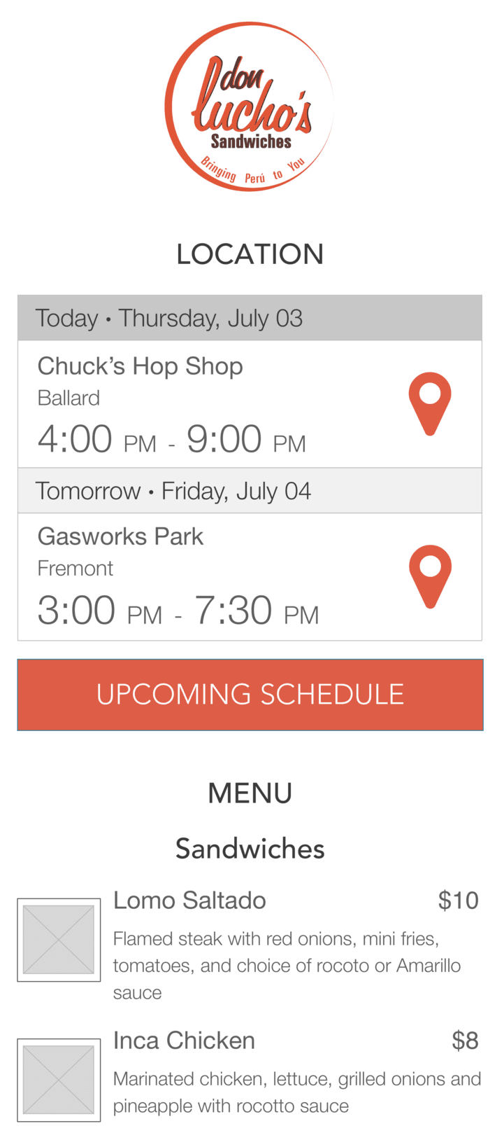
While many other food carts in the area had websites that show their updated schedules using an embedded Google Calendar or the most recent posts from different social media iframes. Carlos wanted his website to be more than that showing his upcoming locations, menu, ability to take catering requests and his biography.
Before we started the sketching and prototyping stages, we conducted a competitive analysis by looking at other food truck websites that visited breweries on a regular basis. With that information we were able understand how Carlo’s website could improve on:
After discussing our findings and recommendations, Carlo wanted to have:
Based on the findings, we decided to take a mobile first approach and began brainstorming various versions of how the website would look like on paper. After multiple rounds of brainstorming and discussion, we finalized our designs with a hi-fi mockup of how the site would look like.
We decided to only show 2-3 upcoming events and conceal the rest because 80% of users would only begin searching for food carts a few days in advance or the day of based on research findings.
Once Carlo approved what we came up with, we started developing his site using Yeoman, Bootstrap, SCSS and a little bit of JavaScript to connect to the Google Calendar API.
Since launch in August 2014, customers visit donluchosinseattle.com regularly. We have also been running analytics to validate our design assumptions regarding mobile first approach and hierarchy of website information. We now know that 61% of the visits are from desktop devices, 35% from mobile phones and 4% from tablets.
Isaac and I have been continuously working with Carlo during our spare time to update, redesign, and optimize the site.
During this project I have been constantly involved in all its phases. Some of the tasks I contributed to were: